


Movies with Original Artwork Slipcovers for Popular Film Collections

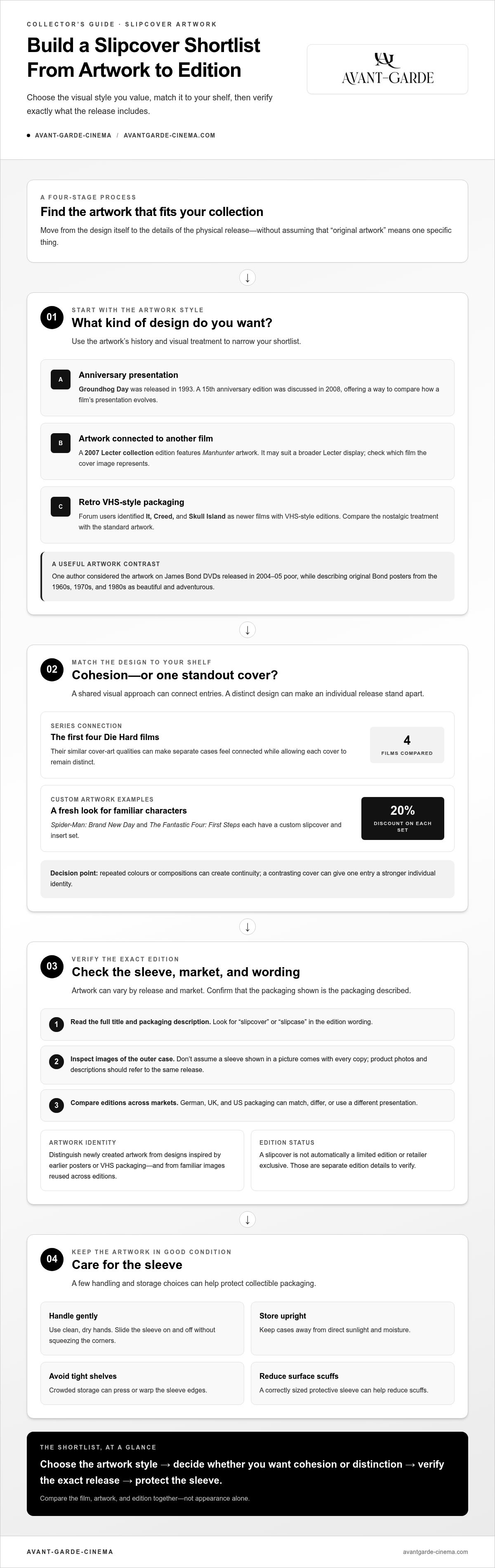
A great slipcover can make a film’s packaging a collectible in its own right. Movies with original artwork slipcovers include releases and custom designs tied to franchises such as Spider-Man and Fantastic Four. The first four Die Hard films are also noted for similar cover-art qualities. Groundhog Day and James Bond releases offer further examples of how artwork can shape a collection’s look.
Collectors know a striking cover can change how a title looks on the shelf, especially when its design stands apart from standard home-video packaging. The key is to distinguish newly created slipcover art from designs inspired by earlier posters or VHS packaging, and from familiar images reused across editions.
This guide explores slipcover artwork across popular film collections, including science-fiction and fantasy franchises. Examples span custom designs, retro-inspired presentation, and shared visual approaches across a series, with details to help you decide which styles suit your collection.
Table of Contents
Cover artwork for popular film collections
Slipcover art can unify a franchise or spotlight one film. Spider-Man: Brand New Day shows how custom artwork can refresh a superhero release. Its custom slipcover and insert set is discounted by 20%. The Fantastic Four: First Steps has a custom slipcover and insert set, also discounted by 20%. These examples pair an outer sleeve with a separate insert. Together, they give collectors more than a standard case design.
Superhero collections often balance recognisable characters with a distinct visual identity. A slipcover might foreground a hero, ensemble, emblem, or dramatic scene. Repeated colours or compositions can create continuity across related titles, while a contrasting design can make one entry stand apart. Spider-Man: Brand New Day and The Fantastic Four: First Steps illustrate how newly prepared artwork can give familiar characters a fresh presentation.
Series artwork also depends on consistency. The first four Die Hard films share similar cover-art qualities. That shared approach can make separate cases feel connected without requiring identical images. James Bond releases show another collecting conversation. One author considered the artwork on DVDs released in 2004-05 poor. Original Bond posters from the 1960s, 1970s and 1980s were described as beautiful and adventurous. Those contrasting reactions show why collectors compare designs across releases.
Do German movie releases use different slipcover artwork from UK and US editions? They can, because packaging is specific to a release and market. Before choosing, compare the German edition’s product images and details with the UK or US version. The artwork may match, differ, or use a different presentation.
Are original artwork slipcovers limited editions or retailer exclusives? Not automatically. A slipcover can accompany a release without being a limited edition or an exclusive. These labels describe separate edition details, so read the packaging description carefully. The word “original” alone doesn’t establish exclusivity.
How can you tell whether a release includes a slipcover before buying? Read the full product title and packaging description, then inspect images of the outer case. Look for “slipcover” or “slipcase” in the edition wording. Don’t assume a sleeve shown in a picture comes with every copy. Product photos and descriptions should refer to the same release.
How can you protect and store collectible slipcovers? Handle the sleeve with clean, dry hands, and slide it on and off without squeezing the corners. Store the case upright, away from direct sunlight and moisture. Avoid tightly packed shelves, which can press or warp the edges. A correctly sized protective sleeve can help reduce surface scuffs.
For superhero shelves, first compare artwork across matching editions. Then decide whether cohesion or a standout cover matters more. The Spider-Man and Fantastic Four examples show how custom designs can add visual distinction, while Die Hard demonstrates how related artwork can connect entries. A strong collection reflects both the films and your preferred shelf aesthetic—and for collectors seeking to complement their physical media with original pop-culture pieces, Fringe demonstrates how handmade sculptures and artwork can bring tangible character to any showcase.
The first four Die Hard films offer a useful point of comparison for collectors. Their similar cover-art qualities show how a shared visual approach can connect separate entries while allowing each cover to remain distinct.
What are the best movies with original artwork slipcovers?
“Best” depends on what your collection celebrates. Some collectors prioritise poster-inspired artwork; others prefer a retro VHS look. A strong choice connects the sleeve design with the film’s identity. Groundhog Day, Manhunter, It, Creed, and Skull Island show different approaches. Compare the artwork, film, and edition together to create a more useful shortlist than ranking titles by appearance alone.
Groundhog Day stands out through its anniversary artwork history. The film was released in 1993. A 15th anniversary edition was discussed in 2008, with attention given to its artwork. That makes it an appealing case for collectors tracing how a film’s presentation evolves. Look at the anniversary sleeve beside another release. Notice whether the design emphasizes the film’s established identity or reframes it for collectors.
For horror and crime shelves, consider the 2007 Lecter collection edition featuring Manhunter artwork. The example offers a useful distinction: a collection’s cover can draw on a related film’s imagery. That connection may appeal to fans building a broader Lecter display. It may be less suited to collectors seeking artwork focused on one specific title. Check which film the image represents before deciding where it belongs.
Retro presentation offers another collecting angle. Forum users identified It, Creed, and Skull Island as newer films with VHS-style editions. These releases bring a familiar home-video aesthetic to more recent titles. Their appeal comes from the contrast between a newer movie and deliberately nostalgic packaging. Compare the sleeve’s treatment with the standard artwork, then decide whether the VHS reference adds character or distracts from the film’s design.
For anniversary collecting: compare Groundhog Day editions and their release context.
For connected film displays: assess the Manhunter artwork in the Lecter collection.
For retro shelf appeal: compare the VHS-style presentation of It, Creed, and Skull Island.
Use a simple selection process. First, decide whether you want original poster imagery, anniversary presentation, or retro styling. Next, check that the artwork suits your preferred film or franchise. Then compare the sleeve with the case design. A striking outer image can complement the case or create deliberate contrast. These details matter when several releases share a shelf.
For a focused shortlist, start with one collecting goal. Choose Groundhog Day for anniversary context, Manhunter for linked-film artwork, or It, Creed, and Skull Island for VHS-inspired presentation. The strongest choice is the edition whose artwork fits your collection’s visual direction. Treat the sleeve as part of the release, not merely as decoration.
Which boutique labels release movies with original artwork slipcovers?
Several boutique labels are worth following for collector-focused physical releases. Second Sight Films, StudioCanal, Shout! Factory, Vinegar Syndrome, and The Criterion Collection are useful names to explore. Their catalogues feature distinct packaging approaches, but a label name alone doesn’t guarantee a slipcover. Check the specific edition’s packaging details and images before adding it to your shortlist.
Second Sight Films is worth exploring when comparing premium-format editions and their packaging. StudioCanal’s substantial film catalogue also makes it useful for searching curated releases. For either label, inspect the specific title: packaging can vary between releases, formats, and editions, even within one catalogue. The name on the spine is a starting point, not proof that a sleeve is included.
Shout! Factory is another label to explore for genre cinema and collector-oriented editions. Its releases feature a range of presentation styles, so check each product listing individually. The label name doesn’t tell you whether a sleeve reproduces theatrical key art or uses newly commissioned imagery. Product descriptions and clear images provide more useful, title-specific evidence.
Vinegar Syndrome and The Criterion Collection have distinct collecting identities. Vinegar Syndrome focuses strongly on genre and cult cinema, while Criterion presents curated releases across international and classic film. For either label, separate the artwork question from the edition question. A release can have distinctive cover art without a slipcover, and a slipcover can use imagery that differs from the case.
Second Sight Films: inspect the exact edition and format.
StudioCanal: check release-specific packaging descriptions.
Shout! Factory: distinguish the outer sleeve from case art.
Vinegar Syndrome and Criterion: assess each release individually.
Use a label-to-edition process. First, identify the label printed on the packaging. Next, search its catalogue by film title and format. Then compare the listed contents with product images. Look for explicit slipcover wording, not just a premium-edition label. Finally, compare the sleeve image with the artwork on the case. This helps distinguish matching packaging from a separate design.
For German collectors, import editions can expand the range of labels and artwork styles to consider. Regional releases may differ in packaging, disc configuration, and printed text. Treat each country-specific edition as a separate item. A familiar label logo doesn’t prove that two regional releases share the same artwork or contents.
The best label to follow depends on your collection’s focus. Genre fans might start with Second Sight Films, Shout! Factory, or Vinegar Syndrome. Those seeking curated classics can include Criterion and StudioCanal. In every case, choose by the title’s actual sleeve, not the label’s reputation alone. This keeps the artwork, format, and edition details aligned with your shelf.
The forum post identifies the Thunderball Blu-ray artwork as a 2012 release. She-Wolves of the Wasteland was released in 1988, and the post describes a DVD release of She-Wolves of the Wasteland from 2007. When comparing these examples, keep the film’s release date separate from the date and format of the edition being discussed, then verify whether the specific packaging includes a slipcover.
How can I tell whether a movie slipcover features original artwork or newly designed artwork?
Start by defining “original artwork.” Collectors may mean a film’s original theatrical poster, or artwork created specifically for a later edition. Those are different things. Near Dark offers a useful example: some early releases reportedly drew on its poster and VHS artwork. A sleeve can therefore reference historic art without reproducing it exactly. Compare the composition, typography, character placement, and colours.
Next, compare the slipcover with known artwork for the film. Near Dark’s poster and VHS presentation provide useful reference points. Matching layouts and imagery suggest a reproduction or close adaptation. A different arrangement, added characters, or changed typography may indicate a new design. Look closely at cropping, logos, billing blocks, and background elements to see whether the sleeve follows an older campaign or reworks it.
Check the release description for precise wording. “Original poster artwork” points to an established image. “Newly commissioned artwork” describes a fresh design, while “inspired by” signals a reference, not necessarily a reproduction. Compare images of the outer sleeve and case separately. Some editions use one image outside and another inside. That difference may be intentional, rather than evidence of a mismatch.
Identify the reference: find the film poster, VHS cover, or earlier home-video design.
Compare composition: check image placement, typography, logos, and colour balance.
Read the edition wording: distinguish reproduced, adapted, and newly created art.
Inspect the packaging: separate the outer slipcover from the case artwork.
Packaging shape matters, too. A forum user described some releases as glued-on face plates, not actual slipcovers. A face plate attached to a case differs from a removable cardboard sleeve. Inspect the edges and product description to identify the format. The recent Power Rangers movie DVD was also described as VHS-style. That label describes its visual treatment, not necessarily the source of its artwork.
Older films can offer useful clues. Halloween 3: Season of the Witch dates to 1982, making its original campaign a reference point for comparing later designs. The Halloween database search reportedly omitted Halloween 6, so one missing result shouldn’t settle the question. Compare the actual title and edition, rather than relying on a single search result or database entry.
Use the evidence together. A description, clear package images, and a matching historical reference provide stronger identification than the word “retro” alone. For Near Dark, compare the sleeve against the 1984 poster and VHS art. For Halloween 3, compare its cover with the film’s earlier campaign. This method helps distinguish reproduced source art from fresh artwork and from packaging that only imitates an older format.
Where can I buy movies with original artwork slipcovers in Germany
In Germany, start with specialist online shops for physical film releases. Their listings often organise titles by format, edition, and packaging. Search the film title alongside “slipcover” or “limited slipcover edition,” then read the full product description. A premium label or collector’s edition title alone doesn’t establish that a removable sleeve is included. The product wording should identify the packaging clearly.
German editions aren’t the only option. Import-focused retailers can carry releases from other markets, including UK and US editions. Artwork, packaging text, and edition contents can differ by country. Treat each regional version as a separate release. Compare its listing and package images with the German edition, then choose the version whose cover design and format suit your collecting priorities.
Label and distributor catalogues can help locate a specific release. Search by film title, then compare available formats and edition names. A listing for a standard Blu-ray may differ from its 4K UHD counterpart. Likewise, a collector’s edition doesn’t automatically include a slipcover. Look for explicit packaging wording and images showing the outer sleeve, rather than relying on a general product category.
Search by title and format: include “Blu-ray” or “4K UHD.”
Check the edition name: distinguish standard and collector editions.
Read packaging details: look for explicit slipcover wording.
Compare regional versions: check artwork and included formats.
Inspect product images: identify the sleeve separately from the case.
Before ordering, match the product description to its images. A sleeve shown in a promotional image may represent a specific edition, not every version of the film. Confirm that the listing’s title, format, and packaging description refer to the same release. For pre-owned copies, inspect photographs for corner wear, creases, fading, or a missing sleeve. These details matter when displaying the package.
Availability can change as editions sell through, especially for limited releases. Keep a shortlist of exact titles and formats. Search using the film name, label, and edition wording together. For example, adding “4K UHD” can separate a UHD release from a Blu-ray listing. If artwork is your priority, compare the actual sleeve design before choosing between editions.
For a focused starting point, explore curated physical film editions. Compare each listing’s format and packaging details with your collection goals. That approach helps German collectors distinguish a standard case from a sleeve-equipped release and identify imports with artwork that suits their shelves.
Avant-Garde-Cinema: Import Blu-rays
Avant-Garde-Cinema offers import Blu-rays for collectors exploring physical releases from other markets. They can be a useful option when a German edition’s artwork or presentation doesn’t match your collection goals. Compare each title’s format, edition details, and packaging description to find a release that suits your shelf. Import editions broaden the range of titles and cover designs to consider, while the specific release determines its artwork and included packaging.
Browse the Import Blu-rays and compare the available titles with your collecting priorities. For further details, visit Avant-Garde-Cinema.
Choose the Edition That Belongs on Your Shelf
The next step is to decide what you want your collection to express. A sleeve can preserve a familiar image, introduce a fresh visual interpretation, or create a distinctive display alongside related films. As you compare movies with original artwork slipcovers, consider which designs you want on your shelf and how each edition fits your collection.
For collectors focused on premium physical editions, Avant-Garde-Cinema offers 4K UHD + Blu-ray Limited Editions, 4K UHD + Blu-ray Limited Collector’s Editions, and 4K UHD + Blu-ray Limited Slipcover Editions. Explore the available releases, compare their formats and packaging, and choose the presentation that suits your collection. Contact Avant-Garde-Cinema today to take your next step as a collector.
Comments